Choice Architecture – Everything You Need to Know
How do you influence people to make better choices for themselves and for your business? Choice architecture gives you all the right tools in your toolbox. What’s more, it’s easy-to-apply and cost-effective.
Article content:
Defining choice architecture, nudges, and choice architect
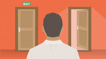
Raise your hand if you think “choice architecture” sounds a bit scary, lofty, or niche.
Well, it’s actually nothing of the sort and much more down to earth. The term refers to how the way you present choices can influence what people end up choosing.
A choice architect is someone who uses tools of choice architecture to indirectly influence the choices of others to make a desired behavior more likely to occur.
“Nudge” is another term linked to choice architecture. A nudge is an aspect of choice architecture that alters people’s behavior in predictable ways without forbidding them to do certain things or heavily incentivizing them.
Nudges make complex choices easier and certain courses of action more appealing but still easy to avoid. If we nudge someone, they have the freedom to choose, but at the same time are swayed to choose a certain way.
A choice architect is someone who uses tools of choice architecture to indirectly influence the choices of others to make a desired behavior more likely to occur.

How does it work?
Choice architects – they sound a bit intimidating, don’t they? “Oh, Phillip is a choice architect, you know,” someone says at a cocktail party. You nodd, clutch onto your Moscow mule, and wonder: Who could this ethereal creature be?
Do you picture him as a brainy Ivy league graduate who wears swanky pointed shoes and works at a high-tech office doing God knows what?
The truth is, you’re a choice architect. And so is everyone else! Every day, even numerous times a day! Every time you choose to serve dinner from a dessert plate instead of a dinner plate. Every time you place sweets on an upper shelf and fruit on a coffee table. Every time you tuck away your partner’s raggedy, horrendously worn-out Michigan State hoodie that he loves for reasons unbeknownst to you (but knownst to us) at the back of the drawer and move the clothes you like on him to the front.
In each of these situations people will make choices – your chubby, prepubescent kid about how much and what they will eat, your partner about what clothes to wear. And you – the choice architect – have shaped the environment in which their choices are made. You’ve presented the options in a way that influences what gets picked (or picked up) and what doesn’t.
Discover ground-breaking ideas and fascinating solutions.
But by doing so, you haven’t mandated anything; your family is free to make any choice they like. Your kid can still get some candy from the top shelf, except they’d probably need a stool or stepladder to reach for it, which requires a bit more effort, so they might end up grabbing an apple from the coffee table instead – after all, it’s less friction. The same goes for your husband and his, er, more presentable clothes.
That’s what choice architecture is all about. The way you present options or information you give influences what gets selected and what doesn’t and even how people feel about their choice.
The way you present options or information you give influences what gets selected and what doesn’t and even how people feel about their choice.
As a choice architect, you have a lot of tools to choose from; so it’s helpful to be aware of what you can use but also what is being used on you. If you aren’t aware of how to nudge, you might miss out on great opportunities and waste money on heavy incentives when a smart default or anchoring might do the trick.
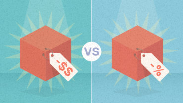
Anchoring
People’s tendency to rely and base their decisions on the first piece of information (often number) offered. The anchor creates a reference point to which people compare other prices.
But no worries, you’ve come to the right place. We’ll be covering the most basic, frequently-used, and important tool from the choice architecture arsenal.
Remember, there’s nothing like a neutral design. As our InsideBE contributor Melina Palmer puts it, you’re a choice architect whether you like it or not – whatever way you present certain options will determine the outcome.
Why does it work?
Choice architecture works because the way we structure the environment has the power to change behavior and people’s decision-making. Even small and seemingly insignificant changes can have a major impact.
The way you’ve changed the environment to influence your family members’ decisions may have been intuitive, but it was powerful nevertheless. You added friction to behavior you wanted to see less of (snacking/overeating, your partner wearing that ratchet hoodie) and made the behavior you wanted to see more of (e.g. taking an apple, picking out more presentable clothes) easier. And that’s the right way to do it.
Knowing what makes us tick can help you “set up the scene” differently and achieve different outcomes.
Knowing what makes us tick can help you “set up the scene” differently and achieve different outcomes.
“Good” choice architecture takes into account how our minds work. We’re fallible, lazy, busy, energy-conserving creatures. We prefer simplicity over complexity, like to avoid big hassles and we filter out everything we don’t need to keep in mind.
Every day, we’re asked to make thousands of calculations, but if we were to weigh every single option carefully, it would take a lot of energy (which, let’s be honest, we don’t feel we have most days). So we often don’t bother with that and let our subconscious mind take over. As a result, we make biased, rushed, and flawed or imperfect decisions.
This might seem like a pretty grim account of things, but the good news is that our irrational decisions aren’t random. The rules by which decisions are made are also known as cognitive biases. If we keep these in mind, we can design an environment that makes new and desired behaviors easier to adopt. The choice architecture arsenal leverages a lot of them.
Choice architecture experiments
The effect of choice architecture has been reported in a variety of experiments. Let’s take a closer look at some of them to describe the impact of different elements we’ve already touched base on, such as defaults, friction, and choice overload.
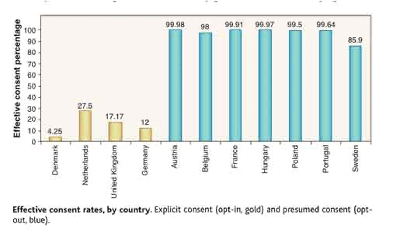
Defaults in organ donations
If you’re an Austrian and in need of an organ transplant, you’re in luck – nearly everyone, 99% of drivers, is registered as an organ donor.
Defaults
The default choice is an option that’s selected if the user does nothing. Defaults are most effective in unfamiliar and complicated situations. They allow people to decide easier and faster.
But if you live in Germany, your chances are much slimmer: only about 12% of drivers are registered. What’s the reason behind such a staggering difference in organ donation rates between these two similar countries that even share the same language?
One of the choice architecture tools: default.
While Germany uses an opt-in system (where you have to specifically check in the box to become a donor), Austria uses an opt-out system where the consent is preselected on a driver’s license application form. Meaning, if you do nothing (don’t opt out of becoming a donor), you’ll automatically be registered as one.
Source: Freakonomics
This effect is seen across the board (literally). In 2003, an online experiment was conducted in the US asking people whether they’d be willing to become donors. When people had to opt in to being an organ donor, only 42% did so, while 82% of those who had to opt out stuck with the default and became donors.
It’s crazy that the use of opt-out defaults should play such a major role in something as significant and personal as organ donation, but it does. Although it’s fair to say that use of defaults, in this case, remains a controversial issue.
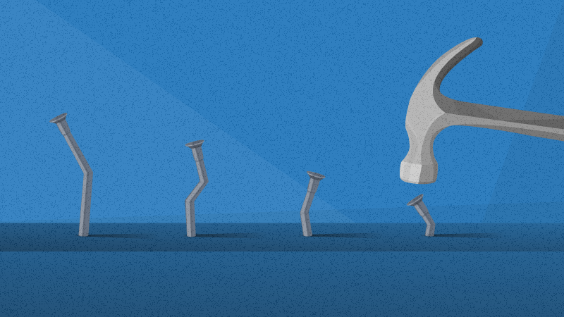
Friction with antibiotics prescriptions
One more and less-heated example comes from the medical field. It’s estimated that 20% of patients now expect to receive antibiotics when they go to see the doctor, which then adds up to a vicious circle of antibiotic overuse and increased antimicrobial resistance.
Friction
Everything along the customer’s journey, which is objectively a little harder than it should be. it needs to be removed to elicit a desired behavior or response.
No wonder strategies to reduce antibiotic usage are urgently needed to prevent serious infections from becoming untreatable. So what can you do as a general practitioner (and an amateur choice architect) to nudge patients to use antibiotics only when absolutely necessary?
You could delay prescriptions: prescribe antibiotics but advise patients not to use them unless symptoms worsen. Or, alternatively, you could ask them to collect a prescription at a later date and ONLY if they don’t get any better.
This approach has in fact been tested and it turns out that this simple change in choice architecture, which added a degree of friction, had significant impacts.
A review of 11 trials with over 3,000 patients found that when antibiotics were provided immediately, 93% of people used them, however, upon a delayed prescription, this figure dropped to a staggering 35%.
Pizza toppings
We’ve already mentioned people will opt in for less features than they’ll opt out from. But how does this influence a choice we think we feel pretty strongly about? Like pizza toppings, for instance.
Researchers at University of Iowa wondered that too and asked 150 students to “build” their own pizza.
One group was asked to build a “basic” $5.00 cheese pizza and add on toppings to create their perfect pizza pie. Students could choose from 12 toppings and were told to check off the toppings they wanted to include (adding one ingredient cost 50 cents).
In the other group, the situation was reversed. Students were presented with a “deluxe ” pizza that cost $11.00 and contained all 12 ingredients. This group was asked to check off the items they wanted to exclude, and they were told that removing an ingredient would reduce the price by 50 cents.
Both groups were encouraged to add or subtract any amount of ingredients they liked until they achieved the perfect pizza.
The second group, which was defaulted to a pizza with 12 toppings, wound up with a pizza with more stuff on it than students who were asked to add each topping individually.
Guess what? The second group, which was defaulted to a pizza with 12 toppings, wound up with a pizza with more stuff on it (5.29 items on average) than students who were asked to add each topping individually (2.71 on average).
The same research was conducted later in one of the pizza capitals of the world: Rome. The Italians might not be used to having as many ingredients available, but when they do, boy they’re even less willing to part with them as Americans. On average they chose pizzas with 7.44 toppings in the strip-down experiment and 3.16 in the build-up experiment.
Jam overload
We’re not done with food yet. Are you a fan of jam? If so, you’ll get a kick out of the next example.
Imagine going to the store and a cheerful-looking lady offers you a sample of jam. Would you be more willing to stop by if she offered 24 or 6 options to choose from?
The famous jam study presented shoppers with the same kind of choice. More people (60%) stopped to sample if there were 24 jams to choose from than when there were only 6 (40%).
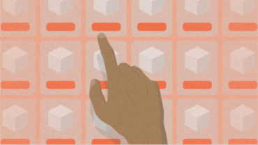
Choice Overload
Choice overload is a result of too many choices being available. It can result in decision fatigue, sticking to the default option, or even avoiding making a decision altogether.
And it makes perfect sense. Would you rather go to a shoe store that sells 24 pairs of shoes or just 6 pairs of shoes? It’s a no-brainer. We love variety.
However, it turns out that more options make it harder for us to choose. Choice overload kicks in when too many choices are available. This can result in decision fatigue, sticking to the default option, or even avoiding making a decision altogether.
Even though 6 jams didn’t cause people to stop by in such great numbers, the study found that if people did stop, they were 10 times more likely to purchase a jar than those who stopped at the 24-option jam stand (30% who made a purchase at the 6-option jam stand vs. 3% at the 24-option jam stand).
History
The story of choice architecture begins with a door described in Donald Norman’s 1988 book, The Design of Everyday Things. Norman, a cognitive scientist, observed a curious thing (we’d like to think it was when he was watching couples on first dates) – doors that make men who try to open them feel like total dimwits.
But it’s not their fault. It’s the poorly designed door that “tells” them to push even though it’s built to be pulled. The Norman door (yes that’s an actual term) is an example of poor design that leads to error and needless frustration.
Source: YouTube
Perhaps you have an e-shop or company webpage. How can you check whether your page has the same problem? When things that should be easy are objectively hard or when your test users can’t figure out how to perform a basic action, it all comes down to poor design.
Norman argues that there’s no reason for these backward designs to persist, since solutions to the problem already exist. His key point is that since humans are asked to make thousands of actions every day, products must be designed for ease of use.
Since humans are asked to make thousands of actions every day, products must be designed for ease of use.
In the early 2000s, Richard Thaler and Cass Sunstein expanded on his work. The term choice architecture was coined by Thaler, who in 2008 along with his peer Sunstein, published a book Nudge: Improving Decisions about Health, Wealth, and Happiness.
The now-classic book “nudged” every human under the sun to pay closer attention to how others influence their decisions and how they can use insights from behavioral economics to influence others (without having to change objective values). The basic idea is to design environments that match how people behave and nudge them toward making more beneficial choices.
As generous as the pair was, they gave us six “tools” that represent the principles of good choice architecture: understanding defaults; expecting errors; providing feedback; understanding mappings; structuring complex choices; and incentives.
Check out the book for yourselves to get the nitty-gritty of each tool, or if you’re more of a podcast kind of guy/gal, then tune into The Brainy Business (episodes 36-41) where our contributor Melina Palmer explains each tool by using a seemingly mundane, yet captivating example of buying an air conditioning unit for her house, and gives a ton of practical advice on how to use it for your business.
Examples and case studies of choice architecture
In the beginning, we talked about how you shape the decisions of others, but what about the times when YOUR choices get shaped by others?
Let’s take a look at some brands that thought long and hard about the way they structured their choices and decision-making environments, which resulted in noticeable and unprecedented increases in sales.
Netflix: Categories & submenu headlines that sell
Have you ever noticed how when you open Netflix, most of the time you won’t even make it to the search bar?
That’s because as soon as you arrive at the homepage, you’re immediately greeted with dozens of shows and movies in the form of not-so-random thumbnails (these are being tested and retested for maximum impact).
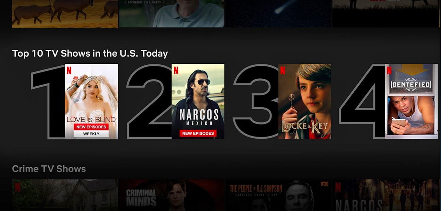
Source: Netflix
The streaming giant doesn’t list them from A to Z. It knows full well that choosing from a list of thousands of titles is complicated, but picking from a few movies within a certain category (named in ways that tap into different psychological drives) can be less daunting.
When there’s less amount of information we have to go through, we can make faster decisions. So chunking down a seemingly infinite number of titles into a meaningful, comprehensive, and FINITE number of categories is a good strategy.
This approach seems to be right on the money, too, since over 80% of Netflix content that users watched have been a result of its recommendation engine and not of someone searching for a specific piece of content.
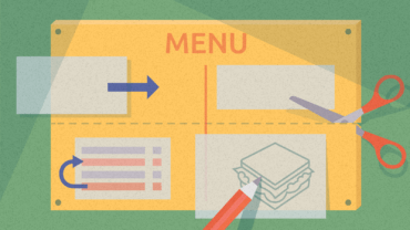
Mitchells & Butlers: A restaurant menu redesign to increase average spend
With 19 restaurant chains under their belt, Mitchells & Butlers understood the importance of a well-designed menu. And so they turned to experts in the field, Cowry Consulting, with the ambitious goal of increasing the average spend per head by 4 pence.
Cowry’s team designed some simple yet well-thought-out changes to the menu to nudge customers to explore more dishes without having to offer discounts or reduce margins.
The original menu tapped into what consumers were already doing: looking for mains.
Main courses occupied two thirds of the menu while only a sixth of the menu was reserved for starters and desserts. This was a key choice architecture flaw. Since a larger part of the menu was dedicated to mains, this set hierarchy defaults that led customers to pay even more attention to them!
Source: Cowry Consulting
The new menu gave equal prominence (a third of space for each) to the mains, starters, and desserts. Other changes ranged from more straightforward ones (cutting down on the number of options and using comprehensive category names) to more intricate ones (displaying the type of glassware the cocktails come in) and even changing the direction that the floral patterns on the menu pointed to (in order to direct customers’ attention inward).
Source: Cowry Consulting
In the end, it boosted the average customer spend by 13 pence. You can read the whole case study here.
IKEA: Choice architecture on steroids
As a retailer, you should make it easy for people to choose because evidence shows that the fewer time people spend deliberating, the more satisfied they are with their final decision.
If, like IKEA, you’re selling 40+ versions of the same item, you might want to make comparing and choosing between them a little bit easier. That’s why IKEA’s product ranges are grouped according to color and design groups.
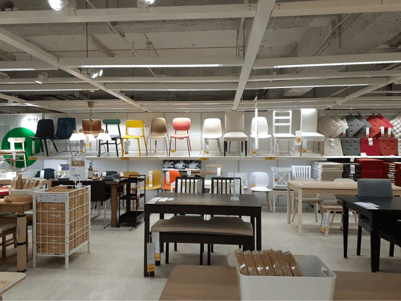
Source: IKEA Bratislava
Customers don’t even need to be aware that these groups exist. What matters is that if they find a chair that they adore, then it’s fairly easy for them to compare it with other chairs they also like (and this has everything to do with grouping them by style).
Making a choice easy is key; but as a retailer, you also want to drive discovery of other products. Think about it. How many times have you picked out something small and innocuous that was not on your shopping list?
To achieve this, IKEA relies on double, triple, and sometimes even quadruple exposure of small and relatively cheap items, usually home accessories. But they also use some sneaky diversions to literally lead you off the path. Yep, those infamous “twists and turns” are there for a reason to help steer customers’ attention to either price or style.
Source: IKEA Bratislava
A retail bank: changing implicit defaults
Our last example comes from the banking sector. A retail bank in Southeast Europe wanted to discourage more customers from opening just basic current accounts and steer them more towards choosing package deals. After months of work and investment in designing and launching a new range of transactional banking packages, it seemed like their customers just weren’t interested.
But the bank was utterly clueless of the fact that their entire choice architecture was unintentionally defaulting customers towards making the wrong choices.
The bank was utterly clueless of the fact that their entire choice architecture was unintentionally defaulting customers towards making the wrong choices.
There were a couple of places where defaults increased the chances of customers sticking to a current account: immediately upon entering the bank, potential clients were only given the option “open current account” when taking a number to be seen by an advisor. On the webpage, the link was named “current account services” which was again, default to the basic product.
Simply renaming the option to Transactional Banking Packages (opening) immediately forced people to explore more alternatives.
Subsequent changes made, such as restructuring the way the current package options were presented on its webpage and at branch locations (a single one-page overview instead of 3 different pages/leaflets dedicated to each package) combined with asking the right questions at a branch, helped the retail bank achieve a 387% increase in sales and a massive boost in customer satisfaction.
How to use it in business?
As a choice architect, you have the responsibility to organize the context in which people make decisions. This can be really powerful. Context DOES matter – what you might consider being an insignificant detail can have a significant impact.
When encouraging decisions and shaping actions, it doesn’t need to be overly complex. This can start with simple questions like can we make it easier or can we make something more motivating?
In the final section of this long read, we’ll point out 3 different (and very human) tendencies and pair them up with 3 choice architecture remedies to leverage them to your advantage.
1. Simplify complex choice
We like to feel like we have a choice, but we hate having too many choices – it just overwhelms us and leads to decision fatigue, sticking to the default option, or even avoiding making a decision altogether. A good choice architecture will structure options, reduce the number of options, or use chunking in a way that’s meaningful to the customer.
One example is Procter & Gamble, who grew aware of the risks of choice overload and decided to reduce the number of versions of the popular Head & Shoulders shampoo by 11 (from a whopping 26 to “just” 15 varieties). “That’s still a lot”, you might think. But it was effective nevertheless. Sales jumped by 10%
The Middle Option
The middle option, also known as the centre stage effect, is our tendency to choose options in the middle. It works best if the differences between the options are simple and clearly communicated.
If you can’t cut down the number of choices, categorize them. It turns out people are more content when choosing from a category (even if the categories are meaningless like A, B, C instead of “mild”, “dark roast”, and “nutty”). Talk about being subconsciously simple-minded.
How about when you’re not selling actual goods, but services such as insurance or banking packages? The general rule of thumb is that it’s good to have three options to leverage the effect of the middle option, but here context matters too.
For example, a UK insurance provider found that with more than two home insurance products to choose from, it quickly became overwhelming.
Since the product was not complicated, the offer was not enhanced by a middle option; customers were confused about what was left out or added to the insurance and basically wondered what they were losing by not taking the top cover and conversely, what they were to gain by taking it?
A team of behavioral scientists chose to go with two options as part of the final product model. This along with other changes in the quote journey increased online conversion and spend rates for insurance policies by 30%.
This illustrates an important point. Behavioral science isn’t a silver bullet. But by testing things out, we can understand what strategies are most effective and scale that accordingly.
2. Rethink the order in which you present your choices
Because of our limited cognitive resources, we don’t (and often can’t) make decisions in absolute terms. Rather, we make decisions relatively based on the context in which we see things.
We get anchored to the first piece of information or price we’re offered, even if it’s totally arbitrary. And for better or for worse, this shapes all subsequent decisions we make; we don’t start from scratch, we start by adjusting the number we were given and then stick to that.
We get anchored to the first piece of information or price we’re offered, even if it’s totally arbitrary.
Every time we see a menu that begins with the cheapest option on the menu we, as behavioral practitioners, cry “Whyyyyy?!” And you should too. If you anchor people low, then they will buy low.
Not to mention the first spot on the menu is the most lucrative real estate you have. Research shows that items placed at the beginning (or curiously, end of the menu) are up to twice as popular as when the same items are placed in the center of the menu.
And this doesn’t only apply to fancy menus.
A food stall in Texas witnessed how simple nudges on its plain blackboard menu increased sales of its underdog item – turkey – by 4-fold. The mega-popular 1775 Texas Pit BBQ paired up with the team of researchers from Human Behavior Lab at Texas A&M University to answer the following conundrum?
So how does one sell lean white meat (with a higher margin) to a bunch of red meat lovers? Offer them a discount? Sure, but that, as you already know, is not a nudge, plus you lose out on that margin.
They relied on choice architecture to guide customers: they made the menu far more comprehensive and less messy, moved turkey and sausage to the top, described both with “romantic language”, and even designed a system that made the both items much easier to try.
3. Design the product for scaling down not building up
The fact that we don’t like to give up on things isn’t exactly news, but the fact that we don’t like to give up on things we don’t own yet is. Remember the pizza experiment and those who landed with a more loaded pizza just because “there was more to begin with”?
You can blame the endowment effect and status quo bias for that.
How often do you buy insurance for a flight? Those extra 20 bucks tacked onto a 900-dollar ticket could save you a lot of headaches, and yet we’re willing to bet most times you don’t even buy it.
What’s the deal here? Usually, you have to opt-in, to get it on top of your ticket. The way the choice is structured implies that the “status quo” is to leave the insurance out unless there is a good reason to add it.
On the flipside, if the ticket included the insurance and you’d have to opt-out of it, you might leave it in just in case a different default would imply that the “status quo” is to leave the insurance in unless there’s a good reason to delete it.
Just remember, if we have to opt-in, many of us will stick with the default option and won’t opt-in. But, if we have to opt-out, many more of us will take the scheme. That’s why scaling down is an effective way of leveraging the choice architecture, as consumers already feel like they own the product and its features.

Keep in mind that features do have to make sense for the product; if the feature is too counterintuitive or controversial, it may detract from the overall perceived value of the product and end up putting people off.
If the feature is too counterintuitive or controversial, it may detract from the overall perceived value of the product and end up putting people off.
Summary
What is choice architecture?
A mechanism upon which you present choices to influence what people choose.
What is a nudge?
A nudge is an aspect of choice architecture that alters people’s behavior in predictable ways without forbidding them to do certain things or heavily incentivizing them.
Who is a choice architect?
A choice architect is someone who uses the tools of choice architecture to indirectly influence the choices of others and to make the desired behavior more likely to occur.
Why does it work?
Choice architecture works because the way we structure the environment has the power to change behavior and the decisions that people make.
A mechanism we use to structure choice is not random but takes into account how our mind works. We are fallible, lazy, busy, energy-conserving creatures.
Knowing what makes us tick can help you “set the scene” differently and achieve different outcomes.
How to use choice architecture in business?
Simplify complex choice
Cut down on the number of options to reduce complexity. If you can’t do this, try categorizing them and making them easier to compare. Use the same attributes and point out how they differ instead of using different attributes for each option, which creates a lot of grief and can result in buyer’s remorse.
Rethink the order in which you present your choices
Once we make a decision about a particular number, that decision sticks with us. We don’t start from scratch, we start by adjusting the number we were given from the start and do everything we can to approximate that. Anchor customers high and remember that the order is crucial. Your anchor must be the first thing your customers see and consider.
Design the product for scaling down, not building up
People will opt in for fewer features than they’ll opt out from. If an offer contains optional components that can be either added or removed, then make sure the default option features them all and your customers have to remove what they don’t want.