Can Making Something Harder Increase Your Sales? 3 Case Studies Where the Answer Was Yes

How can making things a tiny bit more difficult increase your sales and retention? And how to do it smartly, so it doesn’t annoy or alienate customers?
In this article, you´ll discover:
- How to use friction at the right moment or place where making things a bit harder won’t risk losing customers,
- Examples of smartly-used frictions by IKEA in retail, an online publisher in online sales, and by one bank in retention efforts,
- The dangers of so-called “dark patterns” – adding friction that can mislead or confuse customers.
Friction is often portrayed as the enemy, something to be avoided at all costs. But it can actually be a great tool to increase sales and conversions.
If you’re a business leader who has put eliminating friction at the forefront of your company’s efforts, don’t freak out. For the most part, it’s a really smart move because if you make something easier, people will generally do more of it.
Discover ground-breaking ideas and fascinating solutions.
The same is true in reverse – make something harder and people will do less of it. That’s why a connection between increasing friction and customer retention seems quite straightforward. But adding friction can play an interesting part in cross-selling, retail, and even in managing the impact of the Corona crisis. Let’s take a look at businesses and case studies which added friction and achieved more.
The ‘when’ and ‘where’ matters
Take the simple process of cookie consent. Sure, you could take time to carefully manage the settings to do the least damage to your wallet in the long-run. You’d be redirected to a different page where you’d have to work through a bunch of preselected options, figure out what each of them means, optimize them and …argh, what a drag, who has time for that! Or you could simply press Agree and be done with it. Whuff, nice.
Unnecessary effort can be bad for the customer's experience and loyalty. So adding friction must be a strategic enterprise.
Good job! You’ve just avoided friction while unwittingly allowing the site to target you better. Here, a little inconvenience goes a long way in getting you to take an easier way out (which just happens to be the one the business wants).
This is not surprising. Roger Dooley, a neuroscientist who literally wrote a book on friction called Friction (can’t blame him for lack of imagination) defines it as unnecessary expenditure of effort (or proxies for effort – such as money and time).
It can be bad for the customer’s experience and loyalty. So adding friction must be a strategic enterprise.
Friction
Everything along the customer’s journey, which requires effort from the customer. As a rule, it should be removed, to elicit a desired behavior or response.
It requires a tentative, well-thought-out, and deliberate process of identifying the right moment (or place) where making things a bit harder won’t put you at risk of losing a long-time customer. Adding a step early in the sales funnel may be okay, but adding the same step at checkout when customers are impatient to finish the process can lead to the dreaded cart abandonment.
Friction in retail: exposing customers to more stimuli
IKEA’s infamous store layout which twists and curls makes you wonder whether you’re still at a store or you’ve just wandered into the Labyrinth of Crete. Even though there’s no Minotaur at the center of the maze (as if IKEA had any center) at the end of your trip, you will find that your newly purchased Frakta (the famous blue carrier bag) contains more items than you had initially planned to purchase.
But IKEA doesn’t make you confused willy-nilly. The downstairs area (known as the Market hall) is designed to elicit impulsive buys without customers having to engage shop assistants. IKEA uses a great variance of display techniques to ensure finding stuff in a specific department is quick and relatively easy. We write more about it in this article.
But the fact that the little twists and turns cause you to get a little lost across various departments (kitchen utensils, carpets, bathroom accessories) means you get exposed to more items. More stimuli mean a fuller Frakta.
So where to look for added friction? You can’t miss it. It’s front and center!
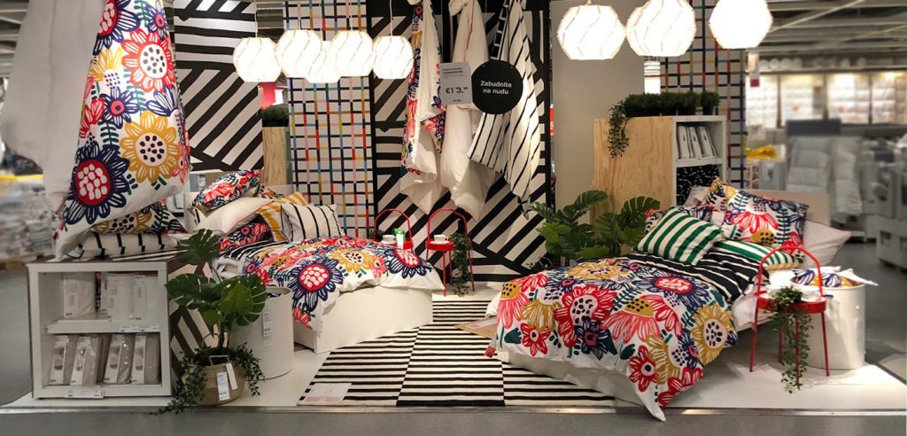
Source: Author’s photo archive
This is a so-called activity area, where customers are deliberately slowed down. Activity areas are located in middle sections of preselected departments (usually in those through which most people would normally just pass quickly). But here they have no choice but to stumble upon new or seasonal products, displayed in a more appealing way than any other products around. It’s salient, well-lit, and there’s a sense of “seasonal activity” taking place at the “premises” (an insider has shared that an actual brief is put together to make sure it conveys a certain theme).
In this case, friction is added to prevent people from picking up a pillow and/or a duvet and running off to the next department. Notice the left hand side of the picture where colorful duvets are hung to prevent customers from seeing what’s behind and moving on more quickly.
By putting up an actual physical obstacle IKEA increases the chance customers will consider products they might otherwise not have paid attention to if they were displayed alongside the standard offer.
Why doesn’t it backfire? A word of caution. It’s important to note that IKEA doesn’t overdo it. We have all seen supermarkets that have undergone “remodeling” only to find we’ve stopped going to them because they went over the top. Shrunken aisles, dead ends, no visual markets, and surprise displays you knock over and spend 15 minutes picking up, are all examples of over-the-top friction which only add to frustration.
At IKEA, friction is never at the expense of mobility or comfort. It offers clear direction marks (the famous arrows) and a predictable layout. Aisles, even the tiny ones between racks of goods, must stay clear at all times and are stringently planned to be a certain width to ensure a shopping cart can comfortably pass through. Remember you’re in it for the long haul.
Friction in online sales: redirecting customers’ attention
Adding friction into a sales funnel may sound suicidal, but so long as you understand where to put it and what role it should play, it could work wonders.
When asked to redesign the landing and subscription page of a newspaper publisher, behavioral experts from MINDWORX deliberately increased friction by adding one compulsory step to the funnel.
The original funnel allowed readers to pick either a monthly or yearly form of subscription. In the next step they could mark additional services that they wished to purchase along with their subscription, such as the mobile app, print newspaper, etc.
In the original funnel, customers who didn’t want any additional services could simply skip this step.
Adding friction can help to direct your customers’ attention towards an option or a feature that otherwise would have gone unnoticed.
After the change, it was no longer possible to do nothing; users had to mark at least 1 out of 4 additional service fields, even if the option they chose was “No additional service”. Since they couldn’t simply skip this step entirely they had to take a moment to consider their choice more carefully.
The key was to add friction early on so that it would not hinder the sales process but would, at the same time, steer customer’s attention towards an option that might otherwise have been overlooked.
The result was a 50% increase in mobile app purchases, which was the additional service the newspaper wanted to sell most.
Friction in retention efforts: make customers pause and reconsider
A bit of friction is a useful tool to slow down customers who, in response to unexpected events in their lives, are making emotional and impulsive decisions, or simply don’t have enough information because of uncertainty. But give them more time or make them think it through and they might arrive at a different decision.
In the spring of 2020, MINDWORX consulted two businesses that were impacted by the sudden loss of income that many of their clients experienced as a result of the Covid-19 pandemic. One was a subscription service called Kontentino. You can read more about how adding friction decreased its customer churn here.
The second was a private bank and this is how their story unfolded. On March 13th 2020, Slovakia locked down, meaning thousands of restaurants, gyms, stores, and other small businesses were suddenly left with no income.
New laws quickly ensued, allowing any client with a mortgage or a loan to postpone their monthly payments up to 9 months. Though people who were severely hit could breathe a sigh of relief, there was a caveat.
The loan postponement didn’t mean a pardon and would later come at a price of having to pay the interest accrued during the period. The postponement was non-extendable and a client could only do it once. That posed a problem in making a well-informed decision. Back then it was hard to picture how long the whole Covid-19 ordeal would last. Would it be weeks (laughable now), months, years? When would be the best time to choose? Should people wait? Should they not? People really didn’t know!
As is the gold standard in banking – the process of submitting a formal request was fully digital and relatively easy – a client went through a funnel in the app or their internet banking and the bank would automatically grant them the extension.
To keep the initial surge in the number of requests as low as possible, the bank wanted to make sure that only clients who could truly benefit from an extension would ask for one. So they called on a trusted team of behavioral experts who had previously helped them decrease friction in their credit card sales funnel with great success.
Now the objective seemed to be upside down (like perhaps, the whole world at the time).
While seamless experience is at the core of digital banking, this time the behavioral team worked on making the process less automatic. Instead of integration and simplification, they looked for ways to segregate and complicate (but not confuse or mislead!) to give clients more opportunities to rethink and reevaluate their decision.
That’s why they proposed adding friction at various points of the funnel.
Making a process a little more difficult can be useful to slow customers down and redirect their attention to what you want them to do. This gives you an opportunity to sell or retain.
They broke the process down into smaller/incremental sections; increasing the total number of steps clients had to go through. They added a checklist clients needed to go through, before they could even begin the process of filling in a form. This not only slowed them down, but also allowed them to access for themselves whether they would truly benefit from taking this action now. Should a client decide to proceed, they were then further slowed down.
At each step of the funnel they had to indicate that they had read the information by ticking a box and when choosing their subsequent action from the two CTA buttons, their attention was steered to a prehighlighted “Think it over”, not to the button which read “Go ahead”.
All of these interventions involved changes in the process (increasing the number or steps, adding elements to slow people down). But experts also worked on copy.
They framed the whole communication in a way that implicitly advised clients to wait. But don’t picture a flat-out discouragement, rather a useful piece of advice pointing to crucial caveats regarding this type of action (the extension was non-extendable, irreversible and one could only do it once).
A word of caution
Making a process a little more difficult can be useful to slow customers down and redirect their attention to what you want them to do. This gives you an opportunity to sell or retain.
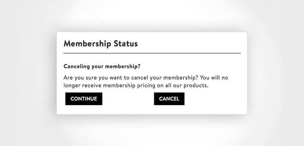
However, you should never make it so difficult that it becomes a dark pattern. A dark pattern could be anything from adding too many steps, or even purposely misleading a customer with confusing ambiguous copy.
Source: Crobox
Here, it’s not obvious which button a customer should click to cancel their membership. This “bad nudge” might work one time but won’t pay off in the long run.
As Roger Dooley in Friction suggests, based on research conducted by CEB Global, loyalty is closely tied to how difficult customers found the interaction with the company to be. A staggering 96% of customers who had high-effort experiences reported being disloyal.
Think about it every time you make a strategic decision to make something a little harder. Adding friction needs to be moderate and purposeful; it’s a pinch of salt that enhances your sales, not a cup of it that sinks the whole meal.
Key Takeaways:
- Like IKEA and the independent newspaper, add friction in situations when you want customers to slow down and to pay attention to something they otherwise may not have noticed.
- If you suspect customers are making impulsive, emotionally driven decisions, look for ways to add friction to slow them down to reconsider. Just like the private bank, use reframing (focus on what they stand to lose if they act on it), add more points of contact or even use defaults to nudge customers to stick with the status quo.
- If there’s an option you wish more customers took, make the option they currently prefer a little harder to choose. If you want more people to call you, but they keep contacting you online, add more fields to the contact form and see what happens.
- No matter what you do, be careful to avoid dark patterns, tricking, or purposely confusing your customers.

