3 Major Factors Influencing Consumer Buying Behavior
There are three major factors that influence your customers’ purchasing behavior. Learn what they are and how you can easily use them to your advantage.
Article content:
The goal of every business is to sell, and there’s just no way around that. But it’s easier said than done, of course – there are countless variables that can influence your customer’s purchase behavior. Even if your product is a no-brainer, if you neglect these aspects, then your customers won’t be buying.
Sellers usually have no idea about them, or they focus on only some of them and underestimate the rest. To stand above the competition, you must pay close attention to the most important factors.
Discover ground-breaking ideas and fascinating solutions.
Generally speaking, you can divide these into three categories:
- Psychological factors
- Social factors
- Situational factors
Now, let’s break them down. In this article, you’ll learn how these factors work, what they include, and how to use them in your business to drive sales.
Psychological Factors
You can look at these as inner drivers of buying behavior. After decades of studying these, psychologists usually split them up into motivation and perception.
There’s a rational way to motivate your customers and then there’s a way that takes human irrationality into account. In the perception section, you’ll learn about price perception and perception of the product itself.
Motivation
When sellers think about how to make customers buy, they usually mean how to motivate them to buy. Even though the motivation is crucial, focusing just on that may lead you astray. But more on that later.
So how do you motivate your customers to buy? Let’s start with the rational approach.
The rational way to motivate customers
There have been many theories over the years, starting with Maslow’s Hierarchy of Needs, Alderfer’s ERG Theory, Herzberg’s Two-Factor Theory, and many more. But what do they have in common? Customer needs.
The basic idea is that we act based on our needs. We eat when we’re hungry, and we buy a new iPhone when we feel like the old one doesn’t make us look cool enough. If there’s a need, we want to fulfill it.
That absolutely doesn’t mean you need to wait for the need to occur. So.. how do you artificially create one?
There are tons of frameworks and principles that can help you to create a sense of need in your customer.
For example, a copywriting technique called before-after bridge. It builds a sense of motivation in three steps:
- Describe the “before” state the customer is currently in very vividly. Include and highlight all the little pains there are that the customer may not be aware of it. In this stage, the customer realizes the need.
“Remember the last time you asked to take out a loan. What did you have to do to qualify for it? Find the nearest branch, drive there, then wait in a line for about forever before even getting to the banker. And all of that before the whole application process even started.”
The “after” state – is the state when all the pains are gone. An ideal world where every customer wants to be – the world where the need is fulfilled.
“Leave that in the past. How about you could skip all these steps and apply from the comfort of your home? Or anywhere else you are. Anytime you want. What if all you needed was 5 minutes, 3 easy steps, and you were done?”
- The bridge – that is your product. The bridge between the states that frees customers of their pains.
“The app X lets you solve all of your banking needs anytime and anywhere. No branch visits, phone calls, or boring paperwork necessary. Just a few clicks and you’re done.”
All you need to do is be very explicit about the pain your customers go through and provide a solution – your product or service.
Taking irrationality into consideration
This was the rational side of things – providing a solution to customers’ problems motivates them to buy. However, the majority of purchase decisions happen non-consciously. There are a lot of cognitive biases we are not aware of that drive our decisions to buy.
For example, Robert Cialdini in his famous bestseller Influence: The Psychology of Persuasion talks about the main psychological principles that drive our purchase behavior – Let’s check a few of them.
Reciprocity, for instance, is a behavioral principle that says that if somebody does something for us, we feel the urge to repay them. That translates as – give your customer something first. You’ll increase their motivation to repay you.
A case study from MINDWORX Behavioral Consulting. MINDWORX and a local telco operator teamed up and sent out thousands of text messages persuading people to donate money for those suffering from various oncological illnesses. People could donate simply by replying with a blank message. The message went:
“If you were in need, we’d be there to help. You can help others today by sending a blank text worth 2 EUR to 848. Thank you! League Against Cancer and O2.”
And the results? This message outperformed the original message by 55%
The commitment and consistency principle is the second one. It's about acting in line with the things we've already said and done. This means that when we commit to something, we are more motivated to do it.
The commitment and consistency principle is the second one. It’s about acting in line with the things we’ve already said and done. This means that when we commit to something, we are more motivated to do it.
Do you want your customers to buy? Let them make a commitment – a little checkbox will do. For example, a mortgage company increased its conversion rate by 11% just by adding a “commitment checkbox.”

Last but not least – scarcity. To be more specific, the urgency it creates. Scarcity tells us that the value of something is higher, just because it’s limited. If we don’t act now, we might lose it.
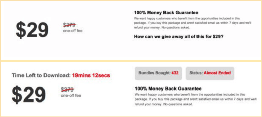
You’ve surely seen this principle a hundred times before, as a limited offer. Let’s compare these two offers:
Source: CXL
By combining a simple countdown with information on how many packages have already been bought in the second offer, the conversion rate increased by nearly 300%.
We’ll go through one more of Cialdini’s principles later, so keep reading.
Perception
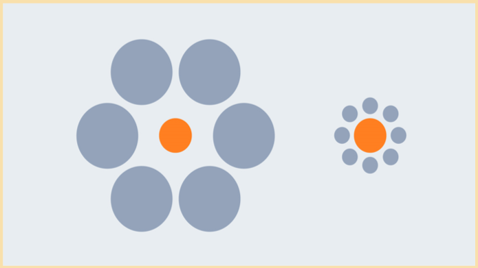
Which orange dot do you think is bigger?
Source: The Illusions Index
The right one, right? It’s clear as day… or is it? The truth is they are absolutely the same size. But what did change, is its surroundings – the context it’s in. The objective size didn’t change, just our perception of it did.
The perception is not about the objective value of your product, objective price, or… objective anything, really.
So how does it make customers buy? Easily – like the orange dots, your product or service may look very different in different contexts.
Price perception
In his online masterclass, Rory Sutherland speaks about the yogurt company Danone, which was desperate to get their yogurt drink in the milk section at the grocery store. A reasonable approach, as it had the highest traffic in the supermarket. The more people who see it, the more people will buy it, right?
However, it was about twice as expensive as regular milk. That means customers would see it alongside the much cheaper milk and would compare the prices of these products, making the yogurt seem far too expensive.
Luckily, someone aware of the power of perception recommended putting the product in the premium yogurt section instead. Suddenly, it didn’t look like expensive milk, but rather a well-priced yogurt.
See? The product itself or its objective price didn’t change. Just customers’ perception of it.
Product perception
Another good example is a case study by Cowry Consulting. The company was approached by a restaurant chain to increase the average spend per head by 4 pence.
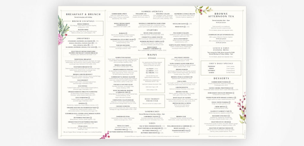
With the power of context and perception in mind, Cowry started by analyzing the environment in which customers choose their dishes – the menu.
Among other things, they noticed that the mains section occupied two-thirds of the menu, while the starters and desserts only a sixth. Naturally, this drew the most attention.
Also, floral prints around the edge of the menu were directing people’s attention off the page as well.
Source: InsideBE
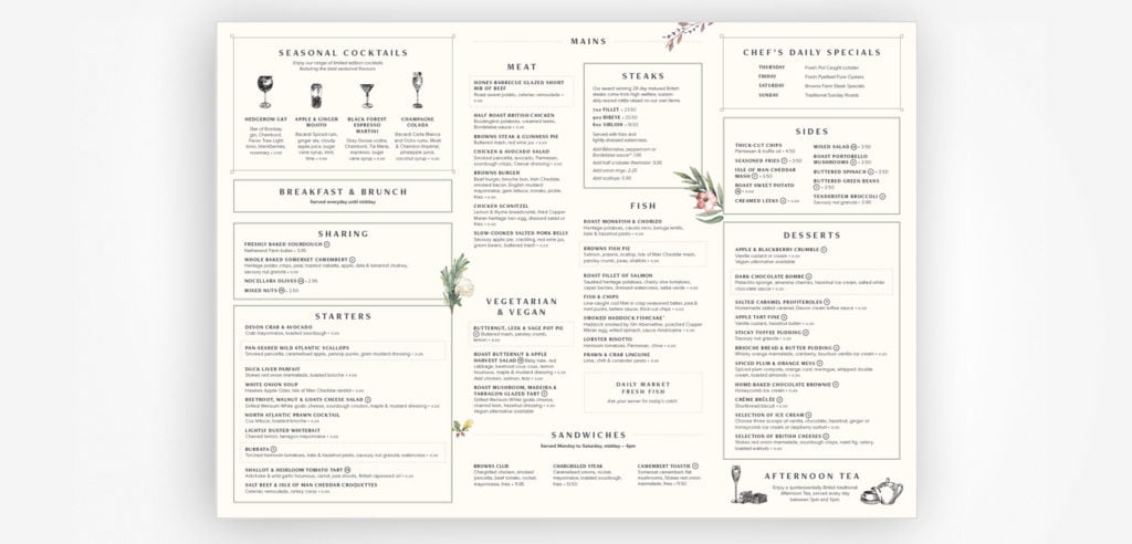
After additional eye-tracking analysis, Cowry made multiple changes to the menu. First, They gave equal space to the mains, starters, and desserts to draw customers’ attention to something else other than the mains.
Next, they changed the position and direction of the floral prints to direct the focus toward the start of each menu section, not away from them.
Source: InsideBE
And as a result? Even though they were tasked with increasing the average spend by 4 pence, they increased it by 13!
Social factors
This is the big one, and it’s another one of Cialdini’s principles. It’s not just our inner needs that motivate us. To a large extent, it’s what other people do. Let’s see how to use it and how it can backfire.
Social proof
The tendency to do what others do is called social proof – when we see a lot of people doing something, we assume it’s the right thing to do. They know what they are doing… right?
When we don't know what to do, we assume that other people do.
This becomes especially true when we’re uncertain. When we don’t know what to do, we assume that other people do. Just think about how many times you looked for reviews and testimonials when considering a purchase. Those 5 stars a couple of times in a row did their job, didn’t it?
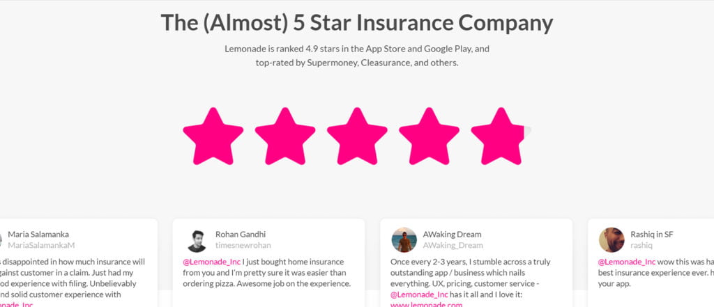
But the thing is – you don’t want to overkill it with good reviews. Check this almost perfect rating of Lemonade – the insurance company:
Source: Lemonade
Even if most of your ratings are 5 stars (lucky you), let your customers know you’re not perfect. Show also some 4, or even 3-star reviews. The perfect rating would be suspicious. This way, it will make you look more honest and authentic.
Social proof doesn’t work well just while browsing through product pages. Even if it seems counterintuitive at first, our tendency to copy others’ behavior is strong. Take the case study from Mindworx Behavioral consulting as an example.
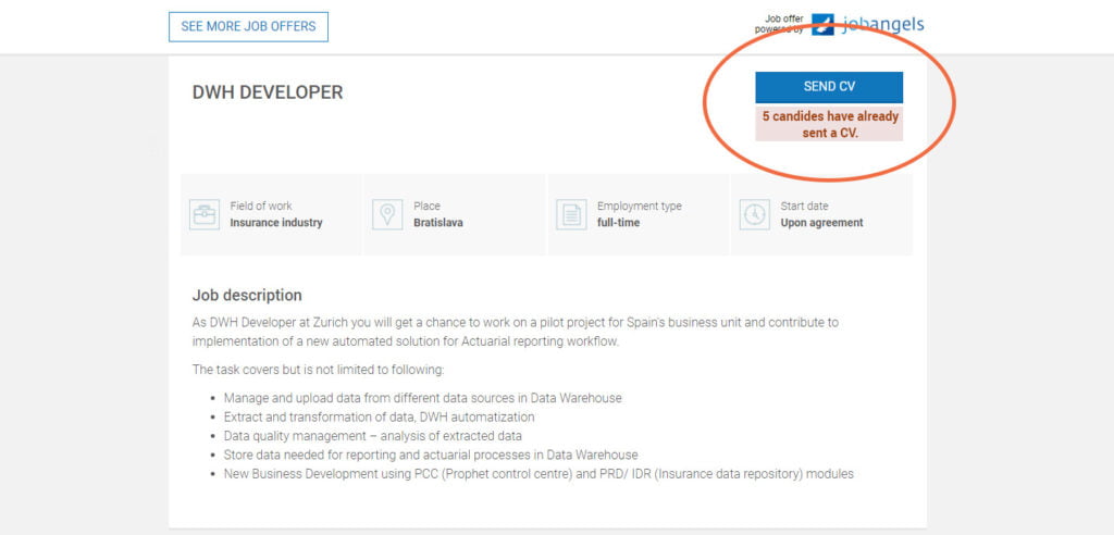
Mindworx was tasked with increasing the number of CVs that job seekers send through the job ad portal. Behavioral experts decided to place a CV counter next to the CTA button, showing how many people already applied for the job.
Source: Job Angels
It doesn’t make sense at first, does it? The more people who’ve already sent in their CVs, the smaller the chance that I’ll get the job.
But actually, the opposite is true. It turned out that social proof increased conversions by 138%.
Watch out for negative social proof
Check out this appeal:
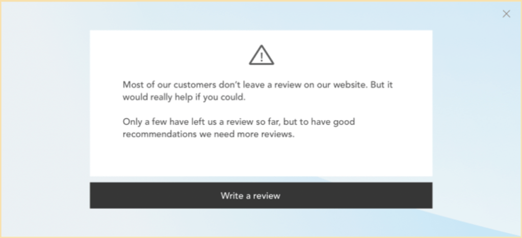
Source: Loss Aversion Ebook
You might think it makes sense. Since most people don’t leave reviews, your review matters so much more. One might suspect (same as the company did) that you would then be more inclined to leave one. But you aren’t.
As you already know from above, social proof doesn’t work that way. It’s the other way around – when we’re told only a few people do it, we figure it’s probably not such a good idea.
This is called negative social proof. That’s why getting more people to vote or recycle, by appealing to what most people aren’t doing, will backfire.
Situational factors
Ok, so you have a great product, great. Your customers are motivated to buy? Cool. BUT. Like it or not, it will sell differently depending on the situation. There are basically 2 types of situational factors that can turn the tables around when played well:
- Triggers – the times when customers are more likely to react to your offer.
- Barriers – obstacles that stand in the customers’ way.
Triggers
Triggers are all about timing. There are times when customers are simply more prone to behave as you want them to. For example, people are more likely to increase their savings contribution on their birthday.
For every product or service, there’s a time that triggers purchase behavior. In these times, customers feel a greater need than they might otherwise.
Take Huidpraktijkshop (yes, that’s a real company). Huidpraktijkshop maps out the life cycle of a product and times email marketing to arrive just when the purchased products were estimated to run out. Not too shabby, huh?
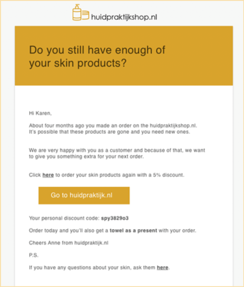
Source: Huidpraktijkshop
A well-timed trigger paired with a small incentive is a great way to get previous customers back on your site for a repeat purchase – before they took the time to look up another webshop selling the same products.
A well-timed trigger paired with a small incentive is a great way to get previous customers back on your site for a repeat purchase – before they took the time to look up another webshop selling the same products.
Just think about the pain your product or service solves. When are the customers most likely to feel it?
For example, studies show people are more likely to eat unhealthy snacks when they’re tired. Exhaustion makes them feel like they deserve a treat. So – if you sell sweets, a good time to target your audience can be the end of their workday.
Barriers
A barrier is anything that stands in your customers’ way to buy. Remember the part from the above, saying focusing purely on motivation can lead you astray? This is why. No matter how motivated customers are. If there are roadblocks in the way, they won’t buy.
No matter how motivated customers are. If there are roadblocks in the way, they won't buy.
Friction
This includes literally anything that makes the purchase objectively harder. It might be a physical obstacle, such as placing a product in the lowest traffic aisle in the supermarket. But it’s just as easy to run into a barrier online.
Take an online purchase funnel. If you run an e-shop, your priority numero uno should be making the purchase as easy as possible. That means removing steps from the funnel. Each extra step that the customers need to take lowers the chance that they will buy.
Ever heard about the $300-million button? A major e-commerce site had just two buttons on its checkout site – Login and Register. What could go wrong, you ask?
It turned out that the form was a huge barrier for customers. They had trouble remembering their login information, including their email, which made the process of resetting the password a challenge. 45% of them registered again and again. There were over 160,000 “Forgot Password” cases, 75% of which didn’t end up with a purchase.
The solution? Removing friction. The company replaced the Register button with the Continue button, allowing customers to continue without registering. The number of buyers increased by 45% which meant an additional $15 million in the first month. Over the year, it resulted in $300 million in new revenue.
Perceived effort
Barriers are not just about how hard the purchase objectively is. It’s also about how hard it seems to be. People have limited cognitive resources, and they really don’t like to waste them. Anything you want them to do, it needs to look easy.
Imagine you’re stuck on the project you’re working on. You decide to browse the internet looking for inspiration. You try to google the keywords and find something right away. The headline says exactly what you needed to hear, so you click on it.
But all you can see is a never-ending block of unstructured text, without any headlines or even paragraphs. Yeah, no, bye. The article might contain useful information, but you just didn’t go through it. Why? Because it looked like a hassle.
The same goes for your customers. If the purchase seems hard, they won’t do it. If your product page is just a bulk of text with no structure, they won’t convert.
Luckily, there are easy ways how to lower the perceived effort. For instance, you need to use the right words, like “easy”, “simple”, or “it’s enough to.” Those made the process feel like it’s easy to go through. Mailchimp does it very well:
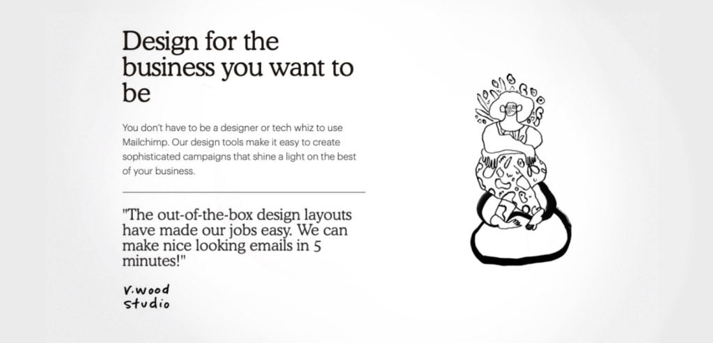
Source: Mailchimp
Also, avoid big piles of text. Structure it into multiple paragraphs instead. Customers prefer more, but shorter paragraphs, as it seems like it won’t take much time to read.
Make the instruction structured as well. Whether you want them to fill out a contact form, sign up for a service, or provide the billing information. How? Simply chuck it into specific steps and tell them exactly how many steps there are.
Like how Western Medical Training Center does it:

Source: Western Medical Training Center Inc.
Then, follow with the explicit steps. Let’s stick with the banking app example from the beginning:
“To use all the benefits of the mobile application, follow these 3 easy steps. The whole registration will take you less than 2 minutes:
- Scan the QR code below to download the application and open it
- Select “I am a client”
- Fill out a couple of boxes and click “Finish the registration”
- And then you’re done.”
Easy, isn’t it? Your customers will certainly think so!
Uncertainties
And finally, one of the biggest barriers your customer can face – uncertainties. Whenever customers are uncertain about anything regarding your product, they won’t buy.
Take another case study of Mindworx. The goal was to get more debit card owners who qualified for free travel insurance for a year to sign up for it.
There was no objective downside to this deal. But – clients simply weren’t signing up for the free insurance. It turned out they had major concerns – that maybe they’ll forget to cancel the insurance when the free year comes to the end, and they will end up paying for something they don’t want.
So the new version of the email addressed these and reassured the clients that they would not forget to opt-out (and get charged for an extra year) because they would be notified when the free period was about to end.
Removing uncertainties along with other behavioral interventions helped to increase the take-up rate of travel insurance by 300%.
Summary
There are three categories of factors that influence customers buying behavior:
- Psychological factors
- Social factors
- Situational factors
Psychological factors
We can divide these into motivation, and perception. You can increase your customers’ motivation by appealing to the pain they currently feel and your product can solve.
As the majority of purchase decisions are unconscious, you can leverage multiple cognitive biases, such as reciprocity, commitment and consistency, scarcity, or many more.
To alter customers’ perception, you can either change the context your product is in, or the product itself. Be aware of the product’s surroundings – that’s what the customer compares your product to. Based on the environment, the product can seem like a great deal, or a total no go.
Social factors
We act as others do. Especially in uncertain situations. To change your customers’ behavior, show them what others already do – they buy your product and they like it.
Show the customers’ reviews and testimonials. But only show the behavior of the majority if it’s actually the behavior you want to target in your audience! Otherwise, it can backfire. Customers will act like others do, even if it’s not the way you want them to.
Situational factors
There are two main situational factors – triggers and barriers. Triggers are about timing – customers are more likely to purchase at certain times, and less likely at other times.
Think about the pain your product solves for customers. When do they feel it the most? That’s when you should target them.
Barriers can be objective – every extra step they need to take that leads to a purchase, or subjective – how hard it feels. The purchase behavior not only has to be as easy as possible but also needs to feel just as easy.
One of the most underrated barriers are uncertainties. Be absolutely sure you have mapped all the uncertainties customers can feel and remove them. Even a little uncertainty can stop customers from buying.
