Perceived Effort – Make Customers Feel that What you Want is Easy

When you want your customers to do something, they need to perceive it as easy to do. Learn what perceived effort is and how to use it to your advantage.
In this article you’ll discover:
- What perceived effort is and why you should make it as low as possible;
- How simply making a product description easier to read cut the number of customers postponing a buying decision by 24%;
- How adding a few more words can increase conversions dramatically;
- Why structuring instructions can nudge customers to action; and
- Why chunking a process into multiple shorter parts can make it feel easier to do.
Let’s imagine a familiar scenario that everyone encounters occasionally: You’re stuck on the project you’re working on, so you decide to browse the internet looking for inspiration. You try to google the keywords, but find nothing on the first page, so you try some others (there’s nothing on the second page, everyone knows that).
Discover ground-breaking ideas and fascinating solutions.
And finally, you find something. The headline says exactly what you needed to hear, so you click on it. But all you can see is a never-ending block of unstructured text, without any headlines or even paragraphs. Yeah, no, bye. You close the page faster than if your boss had caught you watching Netflix during work time.
Now imagine something similar happening to your customers when they visit your website, see your product descriptions, or open your direct emails. Nobody wants that.
So, what exactly is happening there?
If it looks hard to do, people won’t do it
The article could have contained valuable information. It probably did, and you know it. But you just refused to read it because it seemed too hard to read. Maybe it was an enjoyable, well-written article, but if it seems like too much work, people won’t even bother to start reading.

So, let’s skip to the punchline: If you want a customer to do something, not only does it need to be easy to do, it also needs to feel easy to do. This is called perceived effort.
When Daniel Kahneman, grandfather of behavioral economics, was asked about the best way to change someone’s behavior, he replied: “…there is one good way to do it and one bad way. The good way is by diminishing restraining forces, not by increasing the driving forces.”
If you want your customers to do something, not only does it need to be easy to do, it also needs to feel easy to do.
In other words – make the desired behavior as easy as possible. That refers to objective obstacles in the way, such as if the article you wanted to read was behind a paywall so objectively you couldn’t read it. But there’s also a subjective side of the coin. That’s why we would add this to Kahneman – make the desired behavior feel as easy as possible.
In fact, research by CEB Global, summed up in the book The Effortless Experience: Conquering the New Battleground for Customer Loyalty, points out that objective obstacles account only for a third of how difficult customers think something is. And the other two-thirds? That’s how customers feel about it.
There’s a study by researchers from the University of Michigan in which the authors explore this phenomenon. They gave people short scripts with a description of an exercise routine. One group of people received a hard-to-read font, while the other was given an easy-to-read Arial font.
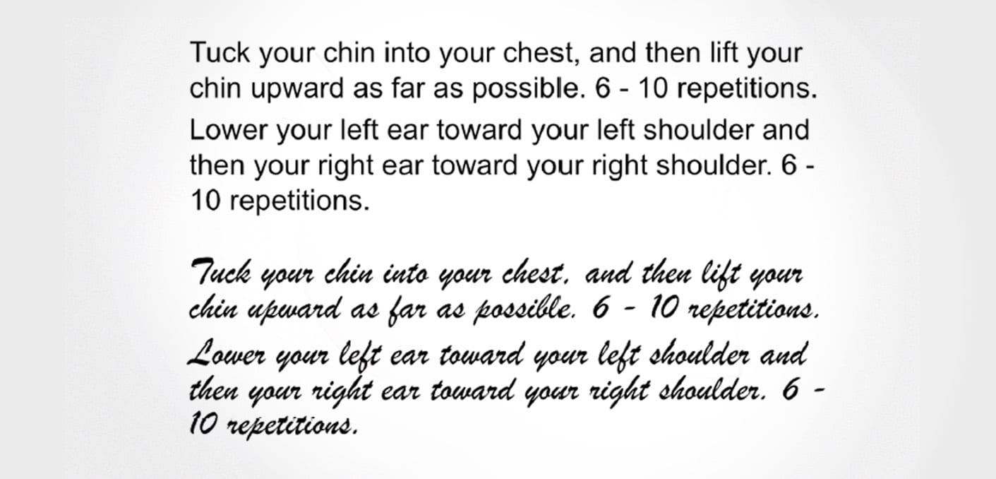
Source: Hyunjin Song & Norbert Schwarz study
The hard-to-read group estimated the exercise would take around 15 minutes. By contrast, the easy-to-read group not only estimated it would take just 8 minutes, but they assumed it would be easier to do and were more willing to incorporate it into their daily activities.
41% postponed the purchase when the font was difficult to read, compared to only 17% of the participants given the easy-to-read font.
The same goes for the business environment. In a similar study, researchers gave people descriptions of the same phone, written in an easy and hard-to-read font, and explored the impact on postponing their decision to buy. 41% postponed the purchase when the font was difficult to read, compared to only 17% of the participants given the easy-to-read font.
Let’s take a closer look at why this happens.
Our cognitive resources are limited
There’s a simple reason behind this – our cognitive resources are limited. Let’s get nerdy for just a couple of minutes to see how decision-making works.
As science shows us (and as you can read in Kahneman’s brilliant book Thinking Fast and Slow), we make decisions in two ways – either quickly and effortlessly (so-called heuristics, or Type 1 reasoning) or slowly and deliberately, but with more effort and energy (Type 2 reasoning).
To engage in systematic, logical thinking we need to tap into Type 2 reasoning and consider all available information to make a rational decision. But that’s hard, takes time and energy, and in many cases it’s ineffective. We don’t need to spend half an hour picking yogurt in a grocery store. That way we’d be exhausted by the time we finished breakfast.
That’s why we use heuristics – automatic cognitive shortcuts based on past experience, which save us time and energy. We grab chocolate yogurt because we always choose it and it’s delicious. No need to read all the yogurt labels and compare nutritional values to pick the right one.
So – once we encounter some task that feels like it will demand a lot of our cognitive resources (i.e. a lot of energy), we’re not really thrilled to do it. Our Type 1 reasoning evaluates it as too much of an effort, and as a wise woman once said – ain’t nobody got time for that.
Tell the customer it’s easy to do using the right words
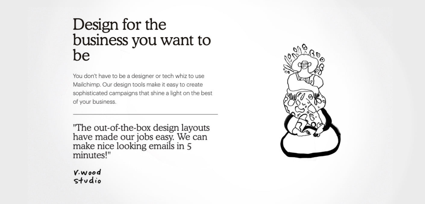
As you can read in multiple InsideBE articles, language is a powerful tool that can make a real difference. With the use of the right words, like “easy”, “simple”, or “it’s enough to”, your customers will feel like what you want from them is not that hard to do. As a bonus, it’s always a good idea to tell them exactly how long it will take. Mailchimp – a useful tool for email marketing – communicate this ease multiple times on their webpage:
With the use of the right words, like “easy”, “simple”, or “it’s enough to”, your customers will feel like what you want from them is not that hard to do.
Source: Mailchimp
While using the word “easy” twice in two paragraphs, they tell the customers how effortless the whole process is by stating exactly how long it will take – in this case, no more than 5 minutes. And that’s enough for customers to evaluate it as an easy-to-do task.
Communicating how effortless an action is was one of the main themes of a case study by MINDWORX Consultancy where they helped to increase conversions for a job-search portal by 154%.

On the other hand, words like “must”, “can’t”, “won’t”, “is required” and “don’t” can do a lot of damage. Lighting company Osram Sylvania knew this and removed these words from their call scripts to drive repeat calls.
So, instead of saying, “We don’t have that item in stock,” they taught their representatives to reassure customers with, “We’ll have stock availability for that item in two weeks.” By this intervention, they lowered their Customer Effort score from 2.8 to 2.2 – 18.5% below the average of similar B2B companies.
Make instructions more structured
More than anything else (well…almost. There’s still the chocolate yogurt) people like structure. And we like it everywhere – we like to have tidy homes, organized work desks, we like our daily routines. Why? Because structured information is easier to process and, you guessed it, requires less energy.
So, the action you want your customer to take needs to be well structured as well, whether it’s filling out a contact form, signing up for a service, or providing billing information.
Western Medical Training Center is a good example:

Source: WMTC
They tell you exactly how many steps it takes. In this way they create a clear structure and give the future trainee an approximate estimate of how hard the process is – 3 steps can’t be that hard, can it? It would be even better if they added “Registration for our program will take you less than 5 minutes”.
By making the instruction more structured, the customer will perceive the same process as much easier.
Let’s say you’re a bank and you’re trying to make your clients use your mobile app, so you approach them with an email asking them to download it. There are two ways to do it. The first would look like this:
“To use all of the benefits of our mobile application, you need to download the application from your mobile store. After opening the application, select the most suitable option. After that, the application will require you to fill in all of the necessary information to continue the process. To successfully finish the registration process, you have to follow the further instructions the application will provide you with.“
Ew. Now, let’s make the instruction more structured and spice it up with some ‘feel-easy’ words:
“To use all the benefits of the mobile application, follow these 3 easy steps. The whole registration will take you less than 2 minutes:
- Scan the QR code below to download the application and open it
- Select “I am a client”
- Fill out a couple of boxes and click finish the registration
And you are done.”
This feels much easier, doesn’t it? By making the instruction more structured, the customer will perceive the same process as much easier.
The same goes for articles. A clever way to hook the reader is to tell them about the structure right in the headline “5 tips to” or “4 ways of” will make it much easier for the reader to actually click on it. Much like this article about 3 Clever Ways to Leverage the Endowment Effect Online.
Chunk bigger tasks into multiple smaller ones to make them look easier
If you are a regular reader of InsideBE (and if you’re not, you’re missing a lot!) maybe you noticed one thing. It’s very rare that any article contains a paragraph longer than four or five lines. Why? Because when we chunk a big piece into multiple short ones, it looks much easier to read.
And it’s not just about reading, but about any other action. Let’s say you’re a customer and the e-shop you recently bought something from asked you to fill out a customer experience survey. And it looks like this:
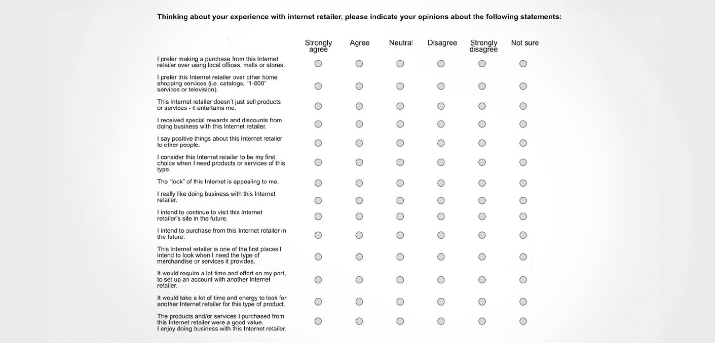
No, that’s not gonna happen. But what if instead, it looked like this:
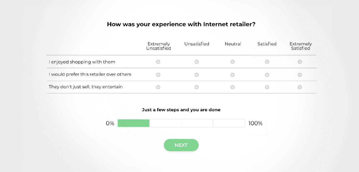
That’s a different cup of tea. It may consist of the same number of questions, but it’s chunked in smaller pieces that look a lot more digestible. And not only that – you can also see the progress you’ve already made, which feels much faster when the chunks are smaller and very easy to complete.
When you want the customer to do something, serve it up in pieces.
So, when you want a customer to do something, whether it’s to register or finish a purchase, don’t swamp them with the whole process at once. Instead, serve it up in pieces.
Key Takeaways:
- If you want your customers to do something, they have to perceive it as easy. If they infer that it will take a lot of effort, they just won’t do it.
- Information has to be easy to read. Whether it’s a set of instructions or a product description, make sure you use an easy-to-read font.
- Use words that imply a feeling of ease – like “easy”, “simple”, or “it’s enough to” and tell your customers that the action won’t take much time. This will reassure them and they will be more likely to do it.
- Structure the instructions for what you want your customers to do. People like structure, and if customers see it, they will perceive the task as less demanding.
- Chunk bigger tasks into smaller pieces that seem like they won’t take much time, and let them clearly see their progress.