Case Study: How IKEA Uses the Decoy Effect to Steer You Towards Higher Margin Products
In this case study, you’ll find out:
- The reason why IKEA happily keeps items that don’t sell well in their portfolio and even designs more of them;
- How to actively use comparison to its full advantage in a way that boosts your sales online and offline; and
- The effective properties of items or offers that few customers will buy, but will still increase your total revenue.
Navigating the world of infinite options
If you have ever felt overwhelmed by choice when shopping you will agree: there’s a fine line between freedom of choice and choice overload. The consequences of too much choice can be severe – author Barry Schwartz does a great job of teasing them all out in The Paradox of Choice. Choice overload can result in decision fatigue, sticking to the default option, or even avoiding making a decision altogether.
Choice Overload
A result of too many choices being available. It can result in decision fatigue, sticking to the default option, or even avoiding making a decision altogether.
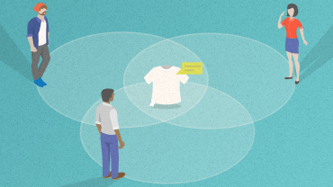
So if you are a retailer who, like IKEA, sells over 9,500 articles or offers 40+ versions of the same item, you might think twice about the impact it’s having on your customers. Wanting to avoid choice overload is a no-brainer. It involves making comparisons and choices a little easier for your customers. But how can you be smart about it? Are there scientific methods that have been proved to work?
It helps to realize that our brains are pattern-recognizing machines and that we navigate the world using context. If we – retailers, product designers, consultants, and salespeople – are aware of this, we can see opportunities more easily and can connect ideas we otherwise would not.
If we know our customers don’t assess options in a vacuum, we can use our understanding of their underlying psychology to design options and offers which can increase sales of other products – those we truly aim to sell.
Comparison helps people understand value. If we control that comparison, we help people understand the value. If we don’t, people will compare it to other things which aren’t under our control.
Discover ground-breaking ideas and fascinating solutions.
How can you create the decoy effect?
Let’s say you run a subscription service that offers different plans. There’s one deal, in particular, you really want to push forward. That’s when you might benefit from something called an asymmetric decoy.
Decoy Effect
Decoy is an option which no one will buy as it is objectively a bad deal. It isn’t designed to be sold and the retailers know it. In fact, they are OK with it. Decoy has a different objective – to make other options seem more attractive.
In the case of subscription, an asymmetric decoy would be a plan that has a lower value (fewer features) but costs around the same as a higher value plan.
Dan Ariely ran a series of experiments to test this effect at MIT. First, he let one hundred students choose between two very different subscription plans for The Economist – the digital version for $59 and the digital & print for $125.
Students didn’t know how to compare them effectively and most of them (68%) chose the cheaper option. Once the team of researchers added a decoy – the print-only version for $125 – the results changed dramatically.
Compared to the print-only option for the same price, the digital & print option suddenly seemed like a good deal and 84% of students chose it over the two. And even though no one chose the decoy, it improved sales significantly.

How can you create the decoy effect even without price?
The decoy effect can occur even when the price is taken out of the equation. For example, how can you make more of your employees opt for water instead of a fizzy drink?
Sam Tatam, the behavioral strategy director at Ogilvy UK argues that putting a more appealing image of water next to a plain one can steer more people toward the more attractive option (avoiding the soda altogether). All of a sudden there’s not just plain water there’s an “inferior” and “superior” version, and the former makes the latter just a little more interesting.

Source: Sam Tatam’s webinar
This brings us to IKEA. No question the Swedish home furnishing maverick could use this little hack in their own cafeteria – a place where cranky husbands are granted a brief moment of reprieve, inexhaustible toddlers are put in high chairs, and where everyone can replenish their strength by choosing which of the vast array of sugary, flavored sodas to gulp down first from their bottomless cup.
But no time for decoys there. The Swedish furniture giant is busy fixing other problems than helping people avoid diabetes. These bigger issues have to do with mitigating the impact of the company’s impressive assortment size.
Previously we wrote about IKEA’s display techniques and product design secrets which speak to customers with different life situations and needs. Now we will take a closer look at a special product line – one that is meant not to sell but still to increase the total revenue anyway.
How does IKEA use “back off” products to create the decoy effect?
With thousands of products (tens of them even in the same category), the potential for choice overload is significant. In order to lower the impact of too much choice and to increase post-purchase satisfaction, IKEA has fashioned a line of specific products called the “back off” products. These serve as a sort of decoy – ranging from beds, chairs, and nightstands to chests of drawers…
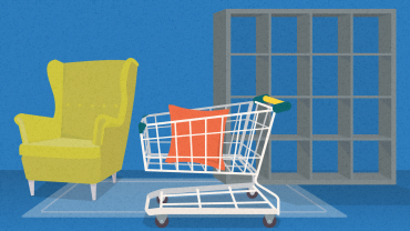
Meet KULLEN for 39,99 € and MALM for 59,90 €, brothers from different mothers.
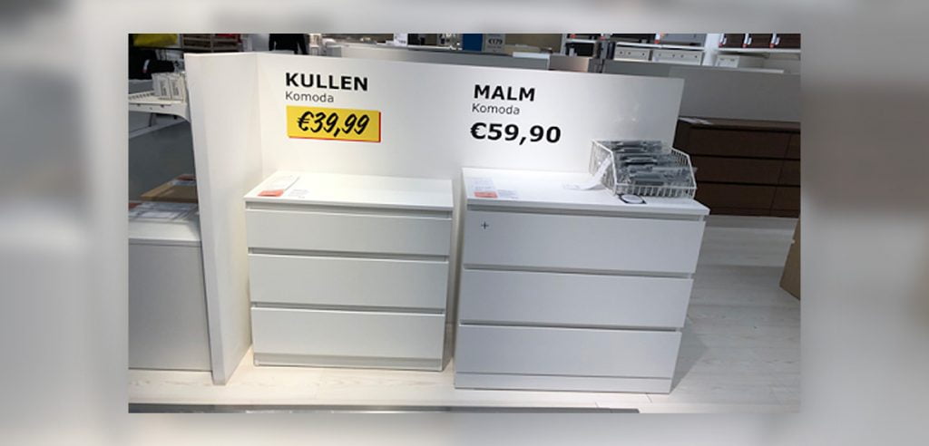
Source: Author’s photo archive
KULLEN is a decoy – a low-profit margin product that IKEA doesn’t intend to sell. It has a similar design to IKEA’s winning horse – MALM, except it’s smaller, made out of inferior quality wood, and the drawers don’t open as smoothly.
Families struggling to make ends meet, or students on a tight budget, will be happy with KULLEN which has the lowest price on the market (indicated by the yellow tag rimmed by red). They get what they came for. No sweat.
Everyone else can be swayed. IKEA ensures customers have plenty of opportunities to compare and contrast the two products. The drawers are displayed right next to each other, and at a prominent spot – a corner of an aisle – so no one can miss them. And if bypassers choose to check them out, the difference when it comes to ease of opening is startling.
Creating a decoy gives people a sense of value, and comparison helps them assess quickly whether something is a good deal or a pass.
Is a relatively low difference in price worth giving up the enjoyable, smooth opening and that satisfying whoosh which comes at the end? Isn’t a cranky husband enough, is 20€ worth choosing a cranky drawer as well? Customers can see it with their own eyes. The decision is a no-brainer. MALM is more expensive, but it doesn’t matter because it is much better value for money!
But don’t think of KULLEN as a waste of resources, it has a purpose. It helps to change the decision-making context and sway customers toward the more profitable option.
Notice that for the decoy effect to really kick in the two offers have to be in close proximity (both online and offline). If a customer found KULLEN displayed next to totally different items, the effect of the comparison would not kick in; they would simply not connect the dots. If this isn’t a devilishly clever example of combining product design with product display we don’t know what is.
Changing the context works because customers often don’t know how much things – or products – should cost. Creating a decoy gives people a sense of value, and comparison helps them assess quickly whether something is a good deal or a pass. It’s a great antidote to choice overload and even buyer’s remorse.
Key takeaways:
- Design a deal that offers much less value but costs nearly as much. Choose the deal or product you want to push forward, then decide what its inferior version would look like.
- Use a slightly inferior option to mitigate the impact of large assortment size. If you sell a lot of items in the same category, a decoy can make comparisons easier. Just like IKEA, choose a product whose value you want to enhance, and add a decoy. Customers might still compare the “enhanced” option to equally good, but different items. But because the option with a decoy will somehow feel better, it’s more likely that the customer will pick it relatively easily and be more satisfied with it.
- Display your decoy in close proximity to the offer you want to push forward. Don’t rely on the customer to connect the dots. For the decoy effect to kick in, it has to be within the same physical context (not a different part of the store or a webpage).