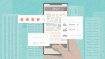
Case Study: Tinder’s Online Sales Funnel and 3 Things Insurance Companies Can Learn from It

3 things the dating app nails from a psychological perspective that insurance companies can adopt.

In this case study, you’ll discover:

  • How Tinder makes the registration process look seamless and what insurance companies can learn from this; 
  • How to remove all the clients’ uncertainties even before they actually occur; and
  • How to present offers so that it’s a breeze for customers to choose (and not just choose the cheapest option).

If your first thought after reading the title was “What? What on earth do these two things have in common?”, then you’re definitely not the only one. But the thing that both- Tinder and insurance companies share is an online conversion funnel. And, as is often the case, one of them does it better. And since chances are you work at an insurance company and aren’t trying to beat Tinder on the dating app market, you probably know which one it is. Yes, Tinder does it better.

Let’s be honest, Tinder has the high ground here. Swiping through photos of good-looking, interesting people… your hormones spiking every time you swipe right as you eagerly await a response before eventually meeting someone- all this sounds way nicer than paying for car insurance.

masterclass course thumbnail
  • Online course
Behavioral Economics & Psychology in Marketing (with certificate)
learn more

But this should only increase insurance companies’ motivation to make their online funnels as engaging as possible. So let’s see what are 3 things that Tinder knows about consumer psychology that insurance companies don’t? And how can you leverage them to gain a competitive edge? 

In the following examples, you’ll see Tinder’s funnel compared to a car insurance funnel. (It took a lot of effort to convince the author’s girlfriend that his registration on Tinder was purely for research purposes, so let’s make it count!)

 1. Make it look easy from the beginning

The first thing any company needs to do in their registration funnel is collect information on their prospective customer. And oh boy, do insurance companies ask for it. In a lot of cases, they simply ask for too much information before they even give you anything in return:

A long insurance form can be overhelming
A long insurance form can be overwhelming and drive potential clients away. Source: https://generali.sk/poistna-kalkulacka/pzp/#/1

They overwhelm potential clients with so much required info in the first step that it feels like the scrolling never ends. And there are 5 more intimidating steps to go through. Sure, they need the info, but there’s a good way to do this and then there’s a bad way. And overwhelming the customer in the first step of the process is definitely the bad way.

What about Tinder’s information gathering?

Tinder's registration funnel
Tinder’s registration funnel asks the users one question at a time to make the process feel easy. Source: Tinder

The whole process is chunked, so they always ask you one question at a time. Why is this a better idea? Even if they ask for the same amount of info as the insurance company, it feels so much easier to complete. That’s because the perceived effort is much lower. 

Perceived effort basically means that if you want the customer to do anything, not only does the action need to be easy to do, it also needs to feel easy to do

  • HOW-TO GUIDE
Perceived Effort: How Easy Things Feel Matters More Than How Easy They Really Are
Download now

Research by CEB Global, summed up in the book The Effortless Experience: Conquering the New Battleground for Customer Loyalty, points out that objective obstacles account only for a third of how difficult customers think something is. The remaining two-thirds is how customers feel about it. 

Definitely take a look at this article to learn more about how you can nudge your customers to take action.

 2. Remove uncertainties

When filling in some of the never-ending questions, it may feel a bit confusing. You just want to know how much the insurance is going to cost you. So why are they asking you to fill in your birth date or home address? Eventually, you can find this out by hovering your mouse over the little ‘i’ icon next to the box, but sometimes it can already be too late. 

case studies square banner
Get access to all case studies available on InsideBE

Discover ground-breaking ideas and fascinating solutions.

LEARN MORE

An insurance company called Lemonade handles uncertainties like this very well. They ask clients about their social security number, which is very private information. However, they explain right away why this information is important and that it can affect the price. And that’s the best thing any insurance company can do.

Uncertainty is a top sales killer and it can easily make the customer abandon the process altogether. That’s because people are naturally quick to avoid it and prefer situations where they know what the possible outcomes are. When the outcome is unknown, this is perceived as a “danger” from an evolutionary point of view. 

  • HOW-TO GUIDE
Uncertainty: The Most Powerful Yet Overlooked Principle in Marketing
Download now

Whatever it is you’re trying to sell, you need to get rid of any uncertainty the customer might have. MINDWORX Behavioral Consulting covered just that as a key element in one of their case studies. By correctly identifying major concerns that clients had, MINDWORX managed to increase email conversions for one insurance company by a whopping 300%

And guess who also removes uncertainties perfectly. Yup! Tinder.

Tinder wants access to a lot of your personal information, and if they communicated this without any explanation behind it, they probably wouldn’t have gotten very far in the biz. However, what’s important is how they ask for it. First, they tell you what you can do in the app (e.g. meet people nearby) before asking for your data after you know what they need it for (e.g. access your location).

Tinder screen
It seems Tinder has considered every uncertainty their users could feel when asked for access to their information.  They remove these uncertainties even before the clients feel any. Source: Tinder

They do it this way so that they can access your photos, contacts, and location right after they remove any uncertainties you might have before any uncertainties even occur to you. 

However, an honorable mention is needed here. 

3. Make the decision to buy as easy as possible

Finally, you’ve fought through all the mandatory white boxes and filled out all the information for the insurance company that you felt didn’t make any sense, and now here you are: standing in front of the final offer. 

Options of the insurance company
Options provided by the insurance company with the cheapest option set as default. As thinking takes a lot of energy, customers will probably stick with the default option. Source: https://generali.sk/poistna-kalkulacka/pzp/#/1

Doesn’t look bad at first glance, but there’s plenty of room for improvement. The first thing is, people, don’t like to think a lot, not even in financial decisions. Simply because it’s hard and takes a lot of energy. 

That’s why they tend to stick with the default option, as they assume it was pre-selected because it’s the best one. In this case, it’s the cheapest one with the least features. 

  • HOW-TO GUIDE
Choice Overload: How to Use Choice Architecture to Simplify Choosing
Download now

If the company chose a different default, then the display could even nicely show what features the customer will lose when they click on a cheaper option. And we can’t stress enough how people hate losing. To be scientific about it, research shows we hate losses almost twice as much as we like gains.

In this case, assuming that customers will opt for the pricier option all on their own is a big mistake. Even if they put effort into their decision, they don’t actually know what they need. Rodent? Rodent what? And how often does the clash with the beast happen? Customers may not see why they should upgrade, so they won’t.

Last but not least, there’s the payment frequency. Paying over €200 all at once might seem like a lot and some customers may prefer to pay a smaller amount more often. After clicking on the other options, the price changes to a semi-annual or quarterly charge, so it’s lower and seems like less of a pain. 

Lower customers' pain of paying via consumer psychology
  • Article
4 Clever Ways to Reduce Your Customers’ Pain of Paying According to Psychology

But… the website doesn’t offer a comparison with an annual plan. So unless the customers manually recalculate the semi-annual or quarterly price to the annual price, they won’t notice that they’ll actually end up paying more than if they stick to the annual plan. And as people don’t like to put energy into thinking very much, they probably won’t do that.

Now let’s see how Tinder does it. The basic version is free. So if they want customers to pay, they need to give them a very good reason. And they do. 

When you really get into it, you might find yourself swiping automatically, and it can easily happen that you’ll swipe away someone you like. Oh no! What if this was the love of your life and you didn’t even know it yet? Tinder knows how you feel, which is why it presents you with the option to go back right at that moment.

But it’s not free, of course. Right after you click on the rewind button, this pop-up window appears:

The option to swipe back right after you made a mistake
Tinder provides you with the option to swipe back right after you made mistake. Source:  https://growth.design/case-studies/tinder-monetization/

Well done, Tinder, well done. What one wouldn’t do for love, right? 

Tinder highlights the most popular option
Tinder highlights the most popular option and combines it well with a loss aversion Source: https://www.google.com/url?q=https://growth.design/case-studies/tinder-monetization

There’s a night and day difference when compared to the insurance company’s offer. First and foremost, they show the customer the most popular option, explicitly stating which option most customers pick. 

This is a very simple yet effective use of social proof: the behavioral principle that says we often mimic what other people like us do. This applies especially in uncertain situations when people don’t really know their way around. For example, if they’re unsure what option is right for them.

Then there’s the magical sentence: “Don’t lose Brooklyn”. Tinder is cleverly amplifying what you already feel – the loss. And as people are loss-aversive, the motivation to get Brooklyn back is even higher now. 

Finally, Tinder is very explicit about how much you can save if you opt for a seemingly higher price and it’s very clear that the 12-month option is the cheapest. 

With insurance, there’s a pretty high probability that customers will choose the basic, cheapest option, while on Tinder, this is very unlikely as they completely switched their attention to whether to choose the most popular option or the most beneficial one. 

Key Takeaways:

  • Make the application process feel easy. Don’t overwhelm clients with too many questions on one page. Chunk it into smaller, more digestible pieces. Answering a few questions at a time looks easier than having them all on one page.
  • Remove all the possible uncertainties clients might feel. Uncertainty is a sales killer and it can drive clients away very fast. Answer all their questions even before they begin feeling uncertain. 
  • Make it easy for customers to decide. They might have no idea what option is best for them and what features they actually need. Show them the most popular option and set it as a default.
  • Be transparent about pricing. Customers need to see very clearly what option is the most and least beneficial. Not only is it more ethical, but it makes deciding even easier.